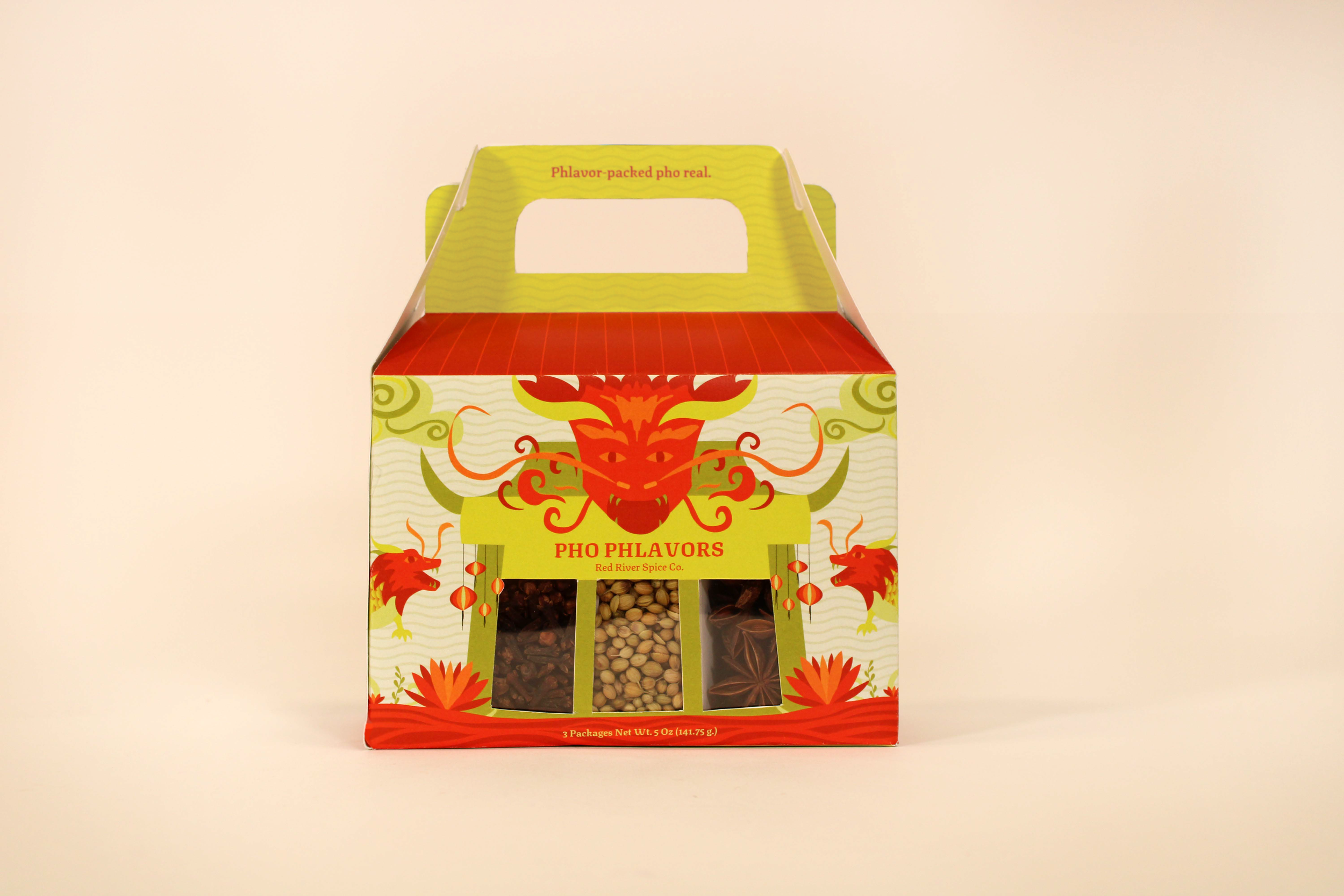
A Vietnamese-owned company that sells convenient packages of assorted spices that can be used in pho.

The goal for typography was to find a serif that had unique corners and cultural elements. After found, was then paired with a simplistic sans serif.

The country’s flag colors, red and yellow, were included and modernized to keep the cultural design cohesive.

Inspired by Vietnamese culture, symbols like the dragon and lotus flower were incorporated in the illustration to bring connection & unity.

Be on the lookout for phunny copy as well!

To create unity, a flat art illustration with subtle hints of a wave movement in the background merge the brand look together. The die-line shape itself takes inspiration from the Vietnamese temples.

Previous
Previous

Willow Wellness

Next
Next

Sweet & Stamped