A real-life one-woman, holistic health coaching business that helps clients heal through food. Based in Bend, Oregon, it aims to help clients find the root cause of their symptoms.
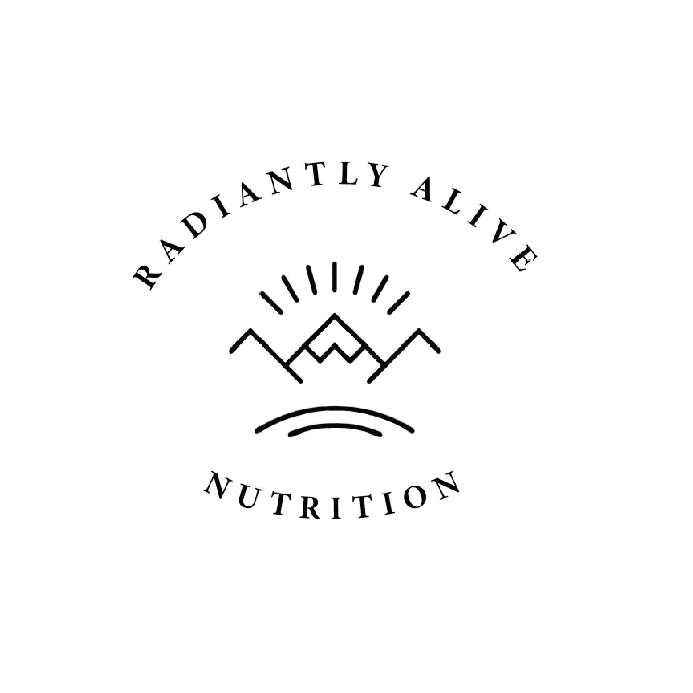
Original Logo: has little sense of hierarchy and type has no personality or brand thought. Feels generic and bland. Overall, could be more personally branded and put together.


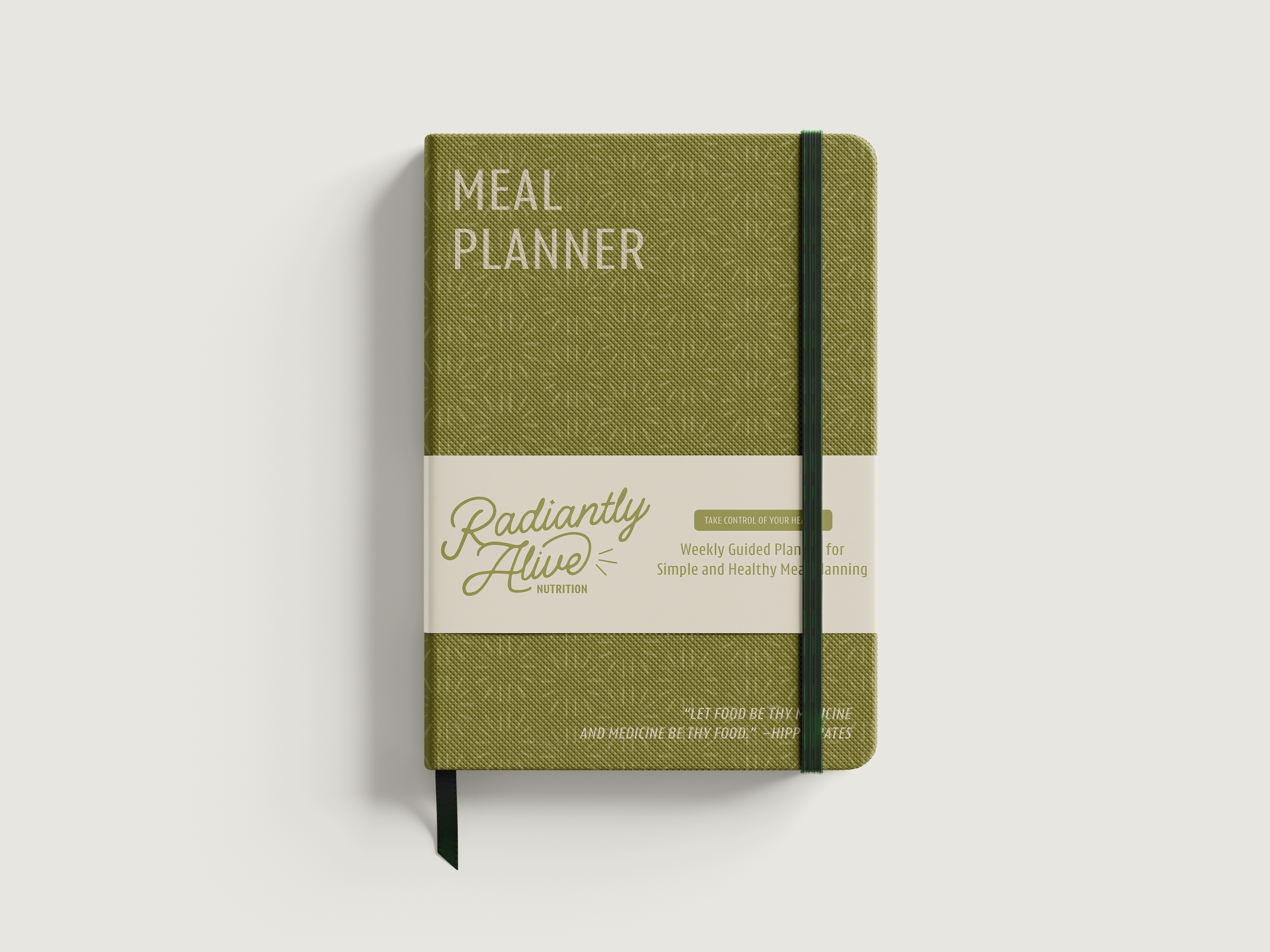
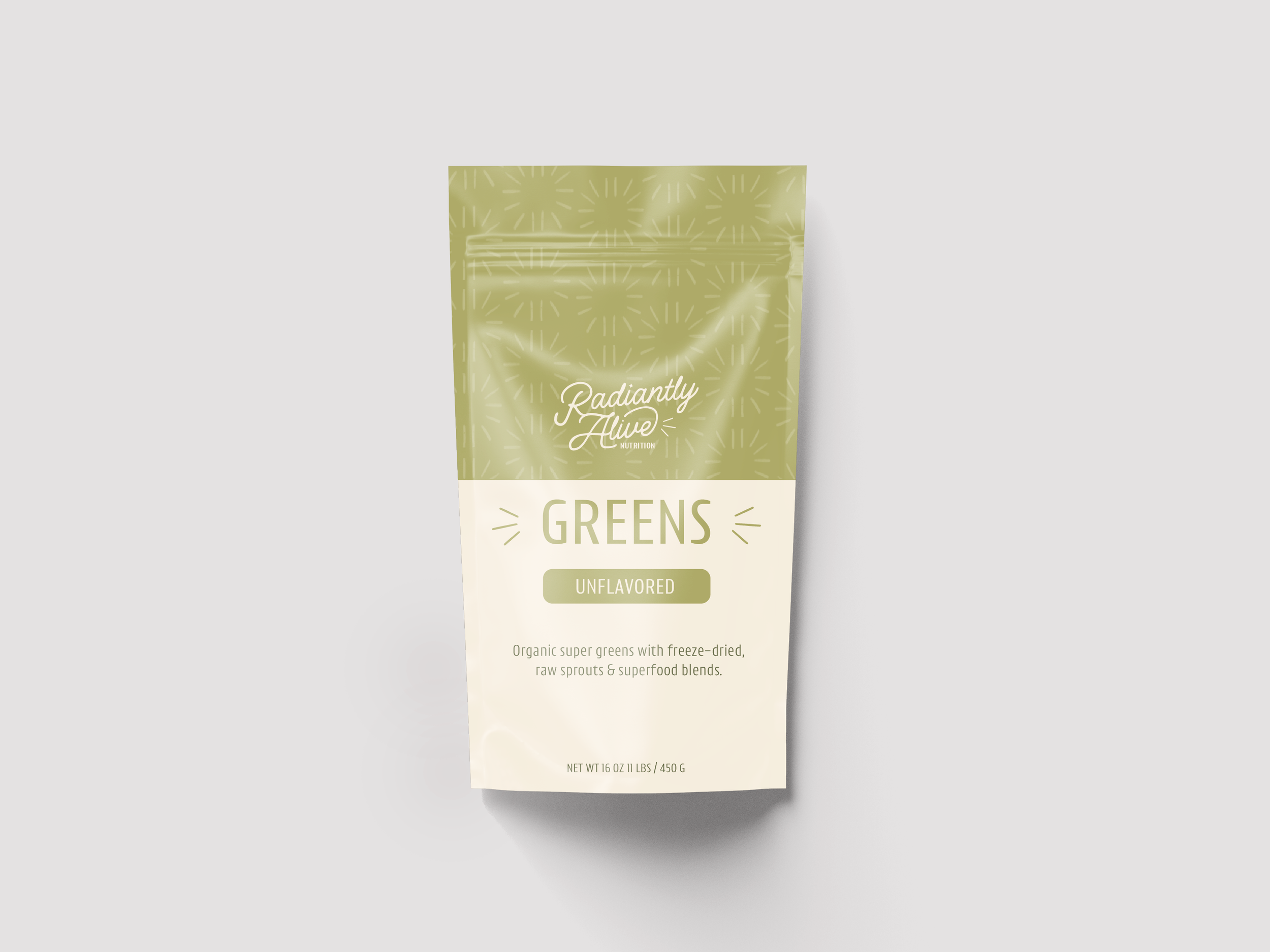
New Logo: more fresh, friendly, and feminine with the script. Logo has a positive, upwards sense of progress. Gave nod to old brand by finding another use for the sunburst element.


Pattern is meant to represent the philosophy “healing from within” with the sunbursts. Is also bringing in elements from the original logo in a new way.